Jägermeister – Global brand design system
2021
Design System
Designer
Jägermeister wanted to move from a shot brand to a global premium spirit, which meant markets everywhere producing their own work without the brand coming apart in the process. The answer was a system built on a single number.
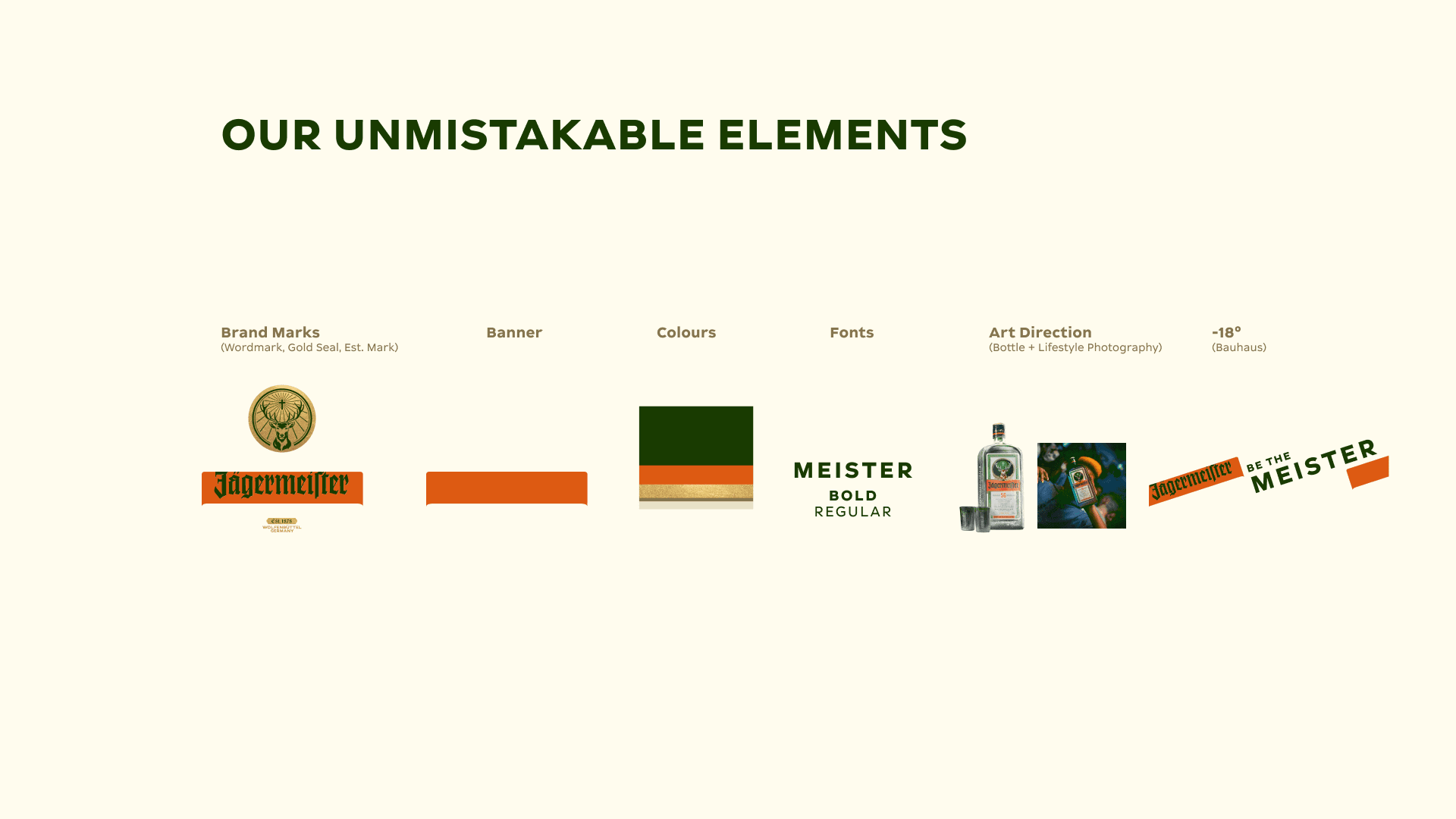
Everyone already knows the drink is served at minus eighteen. So minus eighteen degrees became minus eighteen degrees of rotation: the angle of the grid, the tilt of the banner, the set of the type, the lean of the bottle. A serving instruction turned into the thing that governs every layout, and it does the work of a logo without being one. You can recognise the brand from across a bar by the angle alone.


Around that sit the gold seal, the orange banner borrowed from hunters marking each other in the woods, the Est. mark, the Meister typeface and a green so specific it gets applied to the blacks of every photograph. The rules are strict about what cannot move and generous about what can, which is what lets a vending machine, an Instagram post and a bar poster all read as the same brand.




https://uk.jagermeister.com/